Share this page:
Movie posters have one purpose – to convince audiences to see a movie. In order to do so, the poster must employ a variety of persuasive techniques – visually pleasing colors, a clever tagline, flattering quotes from a critic, star power, a graphically represented attention-getter, etc. At the very least, the poster shouldn’t be an ugly burden on the eyes. Creativity and the all-important “cool factor” are top priorities. If the poster grabs yours attention and makes you think, “Hmm, that looks interesting,” then it’s accomplished part of its goal. It’s sown a seed.
On the other hand, some posters are so horrific that they figuratively scream, “SAVE YOUR MONEY!” How many times have you seen a poster that looked so stupid you immediately thought, “No way I’m seeing that”?
Ladies and gentlemen, here are the first six entries in what will be a continually growing “tribute” to those posters (past and present) that we should thank for warning us to save our time and money.
6. Who is Corky Romano?
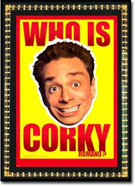 The poster poses a most uninteresting question – who is Corky Romano? Well, Chris Kattan’s goofy smile guarantees that absolutely no movie-goer could be interested in the answer. Does the bright red and yellow color scheme make anyone else think of Hulk Hogan? I’m not sure what purpose is served by the white outline around his head other than to make this it look like a really bad Photoshop job. And that’s probably exactly how this poster came about.
“Hey! Weren’t we supposed to come up with that Corky Romano poster by 2:00 PM?”
“Who is Corky Romano?”
“It’s that stupid Chris Kattan movie.”
“Who is Chris Kattan?”
“Never mind that. What time is it?”
“1:55.”
“Crap. What in the world are you watching anyway?”
“Some stupid Hulk Hogan’s Greatest Matches DVD.”
“That’s great. Anyway, you’ve got five minutes to come up with a slogan and a color scheme for this poster. Just do a Google image search for Chris Kattan and slap a picture of his face on there as well. Use the least goofy one you can find. Nobody’s gonna watch a movie with this guy anyway, so don’t stress about the poster.”
“Gotcha. I’ve got a couple of ideas. Minimal effort is forthcoming.”
If someone were to point to the poster and say, “Hey man, you wanna go see THIS?” I cannot think of a single thing that would cause me to say anything other than, “Not even if someone tried to force me at gunpoint.”
5. Untraceable
 Hopefully Josh Brolin won’t beat me up for making fun of a poster that features his wife, but this is an example of an attempt at cleverness that turned into nothing but awkwardness. If you first viewed this poster on your computer then you probably thought, “Shoot, why is my mouse cursor stuck,” before realizing that was just part of the poster’s design.
What makes this so awkward is that a quick or distant glance at the poster (one that doesn’t involve reading the fine print) doesn’t give an indication that this is a movie about computers; therefore, it just looks stupid.
What we have is a mouse cursor that’s either telling Diane Lane to shush or it’s on the cusp of picking her nose. The poster, by itself, would have been acceptable. Simple, but acceptable. However, you throw in the goofy, out-of-place mouse cursor and what you get is an entry on any discerning Posters Gone Wrong list.
4. Cool as Ice
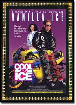 The poster for Cool as Ice is practically begging you to not watch the movie. I have a feeling the designer of this poster absolutely hated Vanilla Ice and designed this while neck-deep in some sort of unresolved bitterness. A close look shows it contains almost every element of a bad poster:
- Ugly color design.
- A neon yellow motorcycle.
- A hideously awful tagline (“When a girl has a heart of stone, there’s only one way to melt it. Just add Ice.”)
- Vanilla Ice’s name in big, bold letters.
- Vanilla Ice wearing a pair of the most ridiculously ugly pants you’ll ever see.
You add the above to ANY movie, and you can just sit back and watch disaster unfold.
I’ll give Vanilla Ice credit – he absolutely bled his fifteen minutes dry. Granted, he left not a single ounce of credibility or integrity in his wake, but something tells me those two things were never too high on his list of career goals.
Now, I completely understand the poster does a more than adequate job of saving you the time and trouble of seeing the film, but in case your curiosity has gotten the better of you then allow me to point out that this was supposed to be a “rap oriented” remake of James Dean’s Rebel Without a Cause.
Anyway, does anybody know who created the poster? I’d love to thank him or her because it kept audiences away. Cool as Ice made a paltry $1,193,062 at the box office, effectively ending Vanilla Ice’s “movie career.” Let this be an example kids – mediocrity may work against itself, but that doesn’t mean it won’t indirectly lead to something positive.
3. College
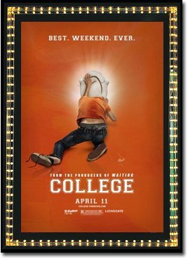 A female friend of mine saw this poster once and exclaimed, “Eww, who’d want to go see that?” This is a reaction that was echoed by the majority of America, as witnessed by the film’s $4 million box office gross. First of all, who wants to see a movie starring Kevin Covais – the bird-looking kid from American Idol? Nobody. So you’ve already got that going against you.
How does the studio decide to counter this albatross? By creating a poster that will repulse 99% of female audiences, 99.5% of older movie-goers, and, well, anybody who is turned off by the sight of a college kid vomiting in a toilet. However, if you hold good taste in low esteem then congrats! You fit the film’s targeted demographic.
They would have been better off showcasing college as an opportunity for higher learning. They could’ve contacted me for ideas, and I would’ve gladly shared my experience – studying for my engineering exams until 4:00 AM all while surrounded by people with absolutely no social skills or recognition of proper hygiene. Folks, I was surrounded by nerds who thought “Let’s convert our potential energy to kinetic energy” was a good pick-up line. It was good times.
Better than sticking your head into a toilet, at least. Would a poster espousing my above ideas have lead to a juggernaut that would’ve toppled Avatar as the all-time box office king? Of course not. But it couldn’t have possibly done any worse than the numbers College produced. And let’s face it; you know you want to see “Let’s convert our potential energy to kinetic energy” as a tagline. Right?
2. Superman 3
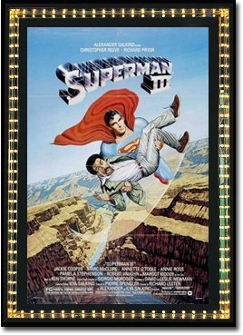 There’s a reason I’ve never seen Superman III. The above poster.
Casting Richard Pryor in a superhero movie was bad enough; designing a poster consisting of a cartoon Superman flying around with a screaming Pryor was just the exclamation point on “Don’t waste your time!” Every time I saw this at the video store I chuckled softly and shook my head. It looks like something George Lucas would put on a cereal box if he had creative control over the Superman franchise.
What studio or marketing exec thought this poster would really reach out to Superman’s intended audience? Even worse, did anyone expect this poster to sell a single ticket to someone who wasn’t already a die-hard fan? This is nothing more than a prime example of a poster that makes it resoundingly obvious that the movie has no possibility of being good. It’s a poster that only Superman’s mama could love.
To be honest, I wish more superhero movies would take a similar route. Imagine if Batman and Robin had co-starred Eddie Murphy. Now picture a poster of a cartoon George Clooney holding a screaming Murphy. We all would have been instantly spared the time and money we wasted finding out how truly awful that film was.
1. Rhinestone
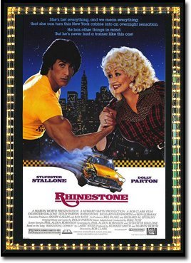 Sylvester Stallone had just established himself as a major action star with three entertaining Rocky films and Rambo: First Blood, so what does he decide to do as a follow-up? A movie about Dolly Parton trying to turn him into a singer. Ouch. They must have thrown some big bucks his way.
From Dolly Parton’s cheesy grin to her ugly grandma outfit to the blatant “muscle flex hand grab” to Stallone’s “Chachi hair,” this poster has absolutely no redeeming value. Is there one person who looks at this poster and thinks, “I’d like to see that”? If so then you might want to keep that to yourself.
Look at Stallone’s face. You can tell he’s thinking, “What on earth have I done?” And man alive, that’s gotta be the longest tagline in cinema history! They practically wrote the entire plot on the poster, and let me tell ya, that’s a little literature that does nothing but strengthen the warning to stay away.
Did you know Stallone does his own singing in the film? I’ve heard it’s awful. Thanks to the poster, I don’t have to waste time finding this out myself. Stallone’s very fortunate his career survived this catastrophe. Very fortunate.
QUESTION
What are some of the absolute worst movie posters you’ve ever seen?

Give me Movie Mark Original Movie Posters any day :p
:p
Amen, brother! You up for making some more? I received an email the other day from someone asking me to post all the old Movie Mark Originals. I had planned on doing that any way, but I will now fast track it.
Then it’s time to begin new ones!